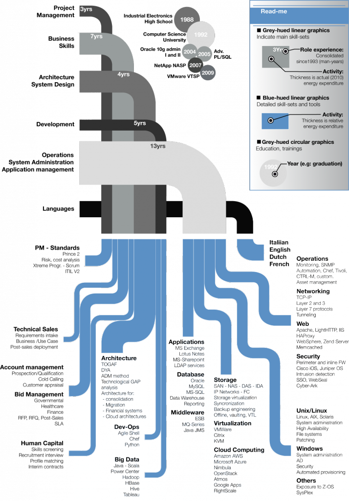
In my last post I described my experience with re.vu. Encouraged by the feedback and for the fun of it I spend some time for more…
Before I started to try other tools to build infographical resumes I looked at some cool examples for inspiration. Nicely done most of them, but I have to admit that these seem to be directed towards specific audiences (which isn’t a bad thing at all, but limits the potential for a new standard) and are tailor-made, which limits the usability for the vast number of people who are not hyper-creative.
I didn’t expect these examples to be generated by free-to-use tools and apps. But nonetheless it was interesting to see how creative one could be (not my core competence).
But let’s get back to the tools and start with
Kinzaa creates a data-driven infographic resume that focuses on the user’s skills and job responsibilities throughout his or her work history. The first step of setting up the basic employment and education data is very convenient as data is simply imported from LinkedIn. After that my user experience got weaker. First, the outcome of my efforts is a rather basic (some might like to call it boring) graphical version of my resume - I even didn’t fully finish it. Second, kinzaa forces the user to pick exactly three responsibilities for every career step. Third, the user should choose personality traits, job and work environment preferences (such as company size, job security, challenge level, culture, decision-making speed). It might not be attractive for some just to limit their opportunities by making job preferences at this moment in their search. Personally I felt that the bi-polar scale in which you have to force your personality and preferences just didn’t match my concept of those and some preferences might also be interdependent, meaning they usually come in a ‘package’.
Nonetheless, these features could be a differentiator to other tools in the market and to be fair, kinzaa is still in beta.
Next stop: vizualize.me
Vizualize.me (also beta), again, turns the user’s LinkedIn profile information into a web-based infographic. The importing runs very smooth and vizualize.me uses more of the data than others, also including e.g. recommendations.
After importing you can edit literally all your data: summary, work experience, education, links, skills, interests, languages, stats, recommendations and awards. Some of this editing needs to be done to make the resume meaningful, but unfortunately some of it is also rather tedious as you will have to choose from a lot of non-intuitive drop-downs to value certain skills or even awards. I went through most of it and have to admit that the result is rather compelling. Just the right mixture between “graphical” and standard “informative”.
Last year Brazen Careerist, a career management resource for young professionals, also launched a facebook app that generates an infographic resume from a user’s facebook, Twitter and LinkedIn information.
After the usual app authorization the app accesses the data from those various accounts and creates an infographic resume with a unique URL (nonetheless you are re-routed to facebook).
The infographic doesn’t look very innovative or creative, but what makes it special is the facebook integration (could be a plus or a minus) and the use of social media metadata such as number of tweets, connections, followers or check-ins. This is not only a distinguishing feature but will become more and more important as future hiring decisions will be also based on your online reputation. But be careful about accuracy (with every automated tool): I am sure, that I have shared more than two (!) links in my online life.
With your resume comes a “Career Portfolio” section which features badges awarded based on a user’s facebook, Twitter and LinkedIn achievements.
We know this kind of “motivator” from foursquare and I somehow liked it, as it is a kind of gamification and therefore very GenY and GenRe (or whatever you like to call them). But I doubt that it is of any real use to employers and it’s only limited fun for the user: “living in one of the 40 healthiest cities” or “graduating from one of the Ivy League schools” are life events and hardly comparable to checking into your favourite gym five weeks in a row.
If you like to see some more creative examples of (info)graphical resumes, you might want to checkout behance or the notorious Pinterest.
Have you used a such web apps to create an infographic resume? If so, which tool did you use and how was your experience? And what do you think of those from the perspective of the recipient who might have to read dozens of those per day? Please just share in the comment section.
P.S.: Job offers based on my resumes please via private message ![]()
Related articles
- 7 Resume Builder Startups That Want To Get You Hired (startupstats.com)
- DIY Infographic Tools Make Anyone a Designer (betakit.com)
- Stand Out With An Infographic Resume (beingyourbrand.com)


